Visual identityBranding
Inštitut za hmeljarstvo in pivovarstvo Slovenije
IHPS - Rooted in Science, Growing for the Future

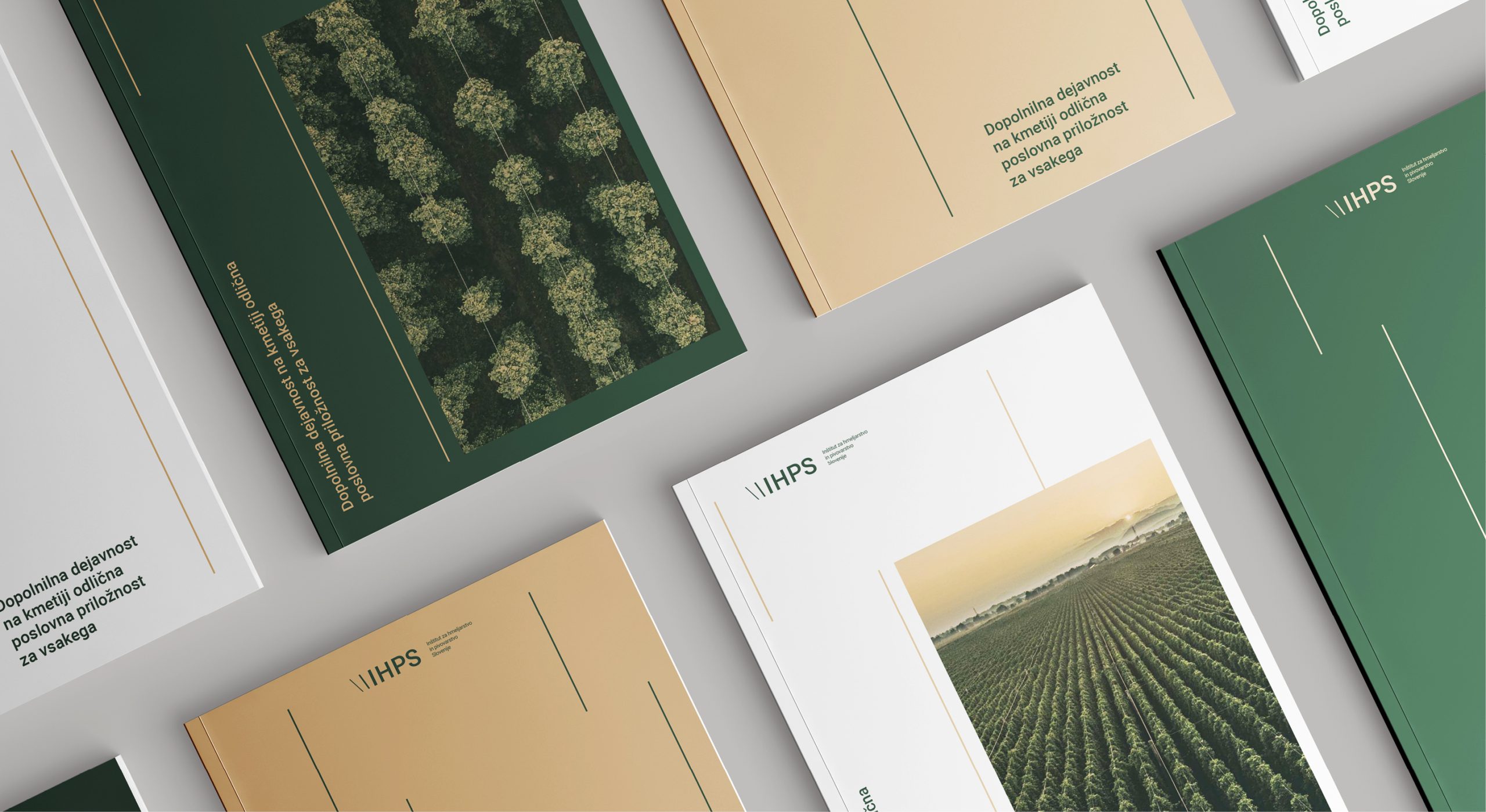
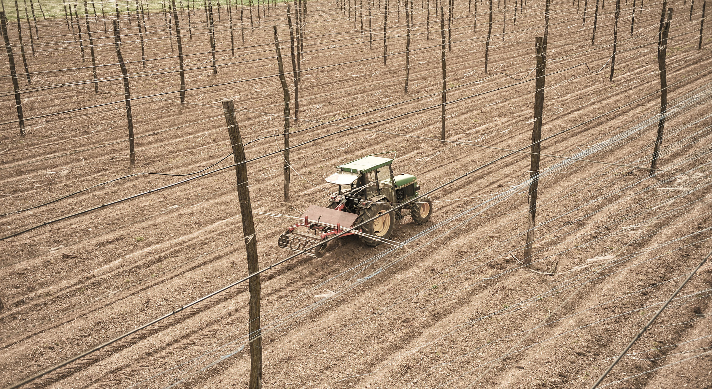


As a cornerstone of Slovenia’s agricultural heritage, the IHPS needed a brand identity that bridged the gap between its high-tech laboratory research and its deep, earthy roots in the hop fields. The goal was to move away from a dated institutional look and toward a professional, authoritative, yet modern aesthetic that represents both “Nature” and “Science.”
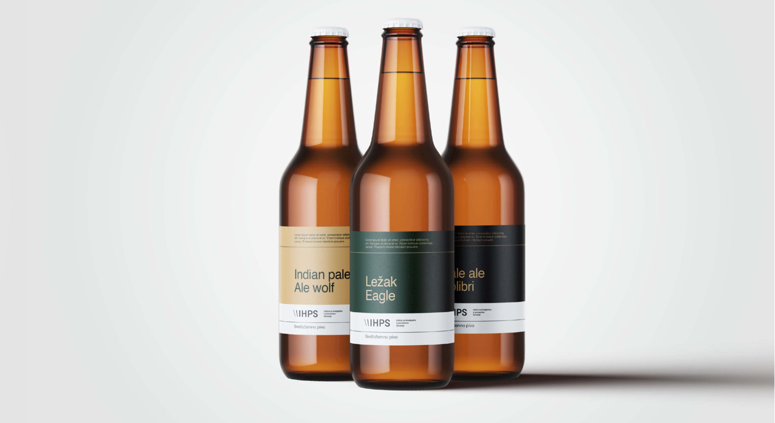
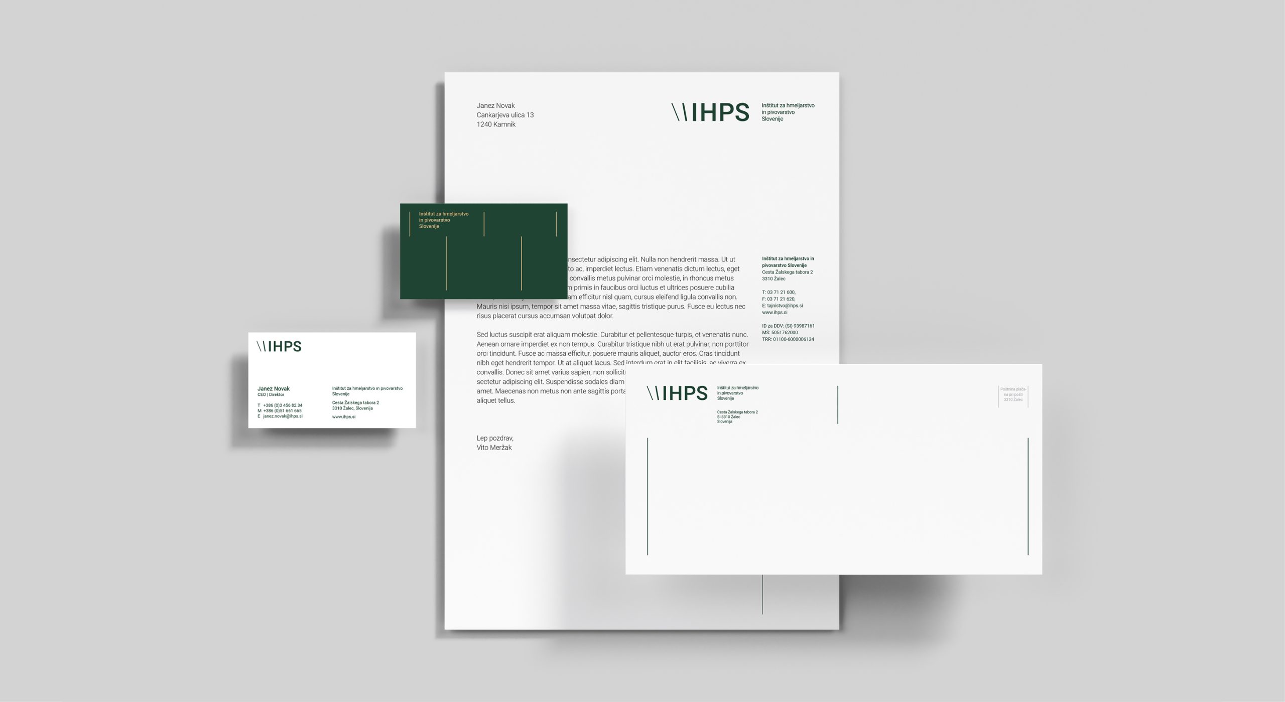
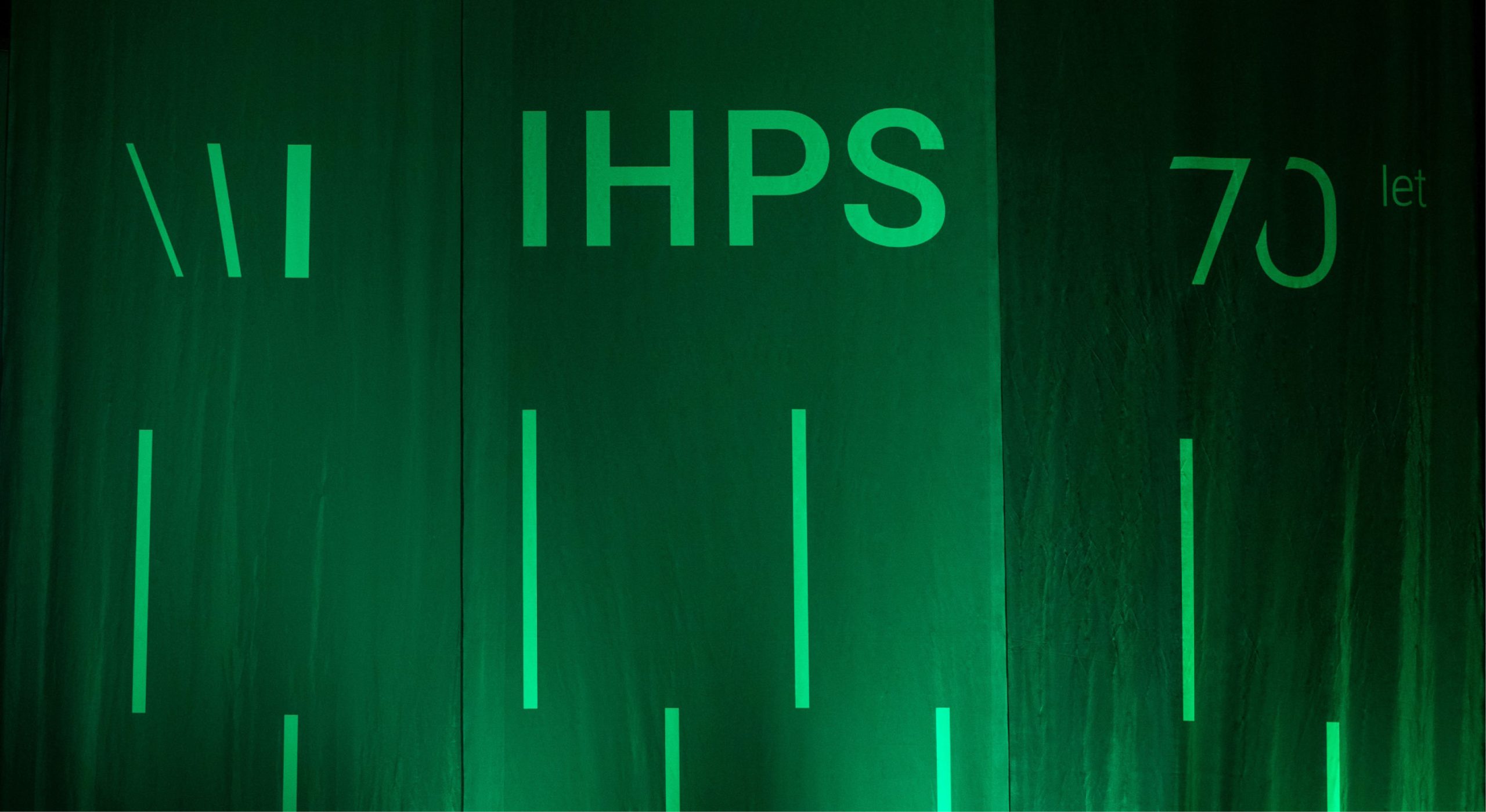
We developed a sophisticated visual system built on the geometry of the hop cone. By combining a “Green & Gold” palette—symbolizing the hop flower and the resulting brew—with clean, technical typography, we created a brand that feels as at home on a lab report as it does on a burlap sack. The identity is anchored by a modular logo that mimics growth patterns and cellular structures, reinforcing the Institute’s role as a leader in both sustainable farming and advanced biotechnological innovation.
The rebranding resulted in a unified and authoritative visual language that positioned the Institute as a modern leader in the global hop and brewing industry.
Brand identity, Rebranding, Visual identity, Marketing strategy, UX/UI, Digital, Events, Advertising, Video and photography, Campaign concept, Copywriting,
Brand management and curation